Introduction to Color Coordination
Color coordination is a fundamental aspect of design that plays a crucial role in fields such as fashion, interior decor, and graphic design. The effective use of color can significantly impact the overall aesthetic and ambience of a space or outfit, enhancing the viewer’s experience and emotional response. Understanding how to mix colors harmoniously is an essential skill that can elevate any creative endeavor.
At its core, color coordination involves the science and art of selecting colors that work well together. This practice is rooted in color theory, which provides a structured approach to understanding the relationships between different colors. The color wheel is a key tool in this theory, illustrating the spectrum of hues and their interrelationship. By analyzing the organization of primary, secondary, and tertiary colors, designers can discover complementary, analogous, and triadic color schemes, aiding them in making informed decisions about which colors to combine.
Furthermore, color can evoke various emotions and perceptions, influencing how individuals react to their environment. For example, warm colors such as reds and oranges are often associated with energy and warmth, while cool colors like blues and greens can foster calmness and tranquility. Knowing how to mix colors while considering their psychological effects is vital for achieving the desired emotional response from an audience.
As we delve deeper into this blog post, we will explore essential color coordination tips that will provide practical guidance on how to mix colors effectively. By applying these principles, anyone can enhance their color choices and create visually appealing compositions, whether in fashion, interior design, or any other creative field.
Understanding the Color Wheel
The color wheel serves as a fundamental tool for anyone looking to enhance their understanding of color theory and its practical applications, particularly in the realm of color coordination tips. At its core, the color wheel is a circular diagram representing relationships between colors. It is typically divided into primary, secondary, and tertiary colors, which together enable individuals to mix colors effectively.
Primary colors, which include red, blue, and yellow, cannot be created by mixing other colors. Secondary colors, formed by mixing two primary colors, consist of green, orange, and purple. Tertiary colors arise from the combination of primary and secondary colors, resulting in hues such as red-orange and blue-green. Understanding these categories lays the groundwork for mastering how to mix colors.
Exploring the relationships between colors reveals much about effective mixing techniques. Complementary colors, which are opposite each other on the color wheel, create a striking contrast when used together. For example, pairing blue with orange can energize a color palette. Analogous colors, found next to each other, like yellow, lime green, and green, promote a harmonious feel, making them ideal for more serene settings. Triadic color schemes involve three colors evenly spaced on the wheel, such as red, yellow, and blue, allowing for a balanced and vibrant composition.
These relationships not only guide aesthetic decisions but also enhance the impact of any design. By strategically applying these concepts, one can achieve stunning results in color coordination. Whether one is painting a wall or selecting an outfit, understanding the color wheel enriches the overall experience of mixing colors. Embracing these principles will significantly refine skills in creating visually appealing combinations.
The Psychology of Color
The interplay between color and human emotion is a significant aspect of color coordination tips. Different colors evoke specific feelings and responses, which can greatly influence a person’s mood and perception in various environments. Understanding the psychology of color is essential for anyone looking to master how to mix colors effectively in design, fashion, or interior decorating.
For instance, warmer colors such as red and orange are often associated with energy, passion, and excitement. These hues can inspire feelings of warmth and encourage social interactions. However, they can also create a sense of urgency or stimulate aggression when overused. In contrast, cooler colors like blue and green tend to convey tranquility, calmness, and balance. Blue is frequently linked to feelings of serenity and is a popular choice for creating peaceful atmospheres, while green is often associated with nature and renewal, promoting relaxation.
Neutral colors, including whites, greys, and beiges, can provide a sophisticated backdrop and can be effectively utilized to create balance amongst more vivid colors. These hues allow the vibrant shades to stand out without overwhelming the viewer, making them crucial in color coordination tips for achieving a cohesive look. When learning how to mix colors, it’s useful to understand that some colors can serve as focal points, while others play supporting roles to enhance overall harmony.
Moreover, brighter colors can stimulate activity and creativity, which can be advantageous in environments aimed at productivity. For example, yellow is often associated with optimism and clarity, making it an ideal choice for spaces intended for brainstorming or work. Understanding these color effects enables individuals to choose hues that resonate with the desired atmosphere, leading to more effective color combinations that achieve specific emotional responses.
Tips for Mixing Colors Effectively
Mastering the art of color mixing requires both understanding and practice. One fundamental approach is to begin with a base color, which sets the foundation for your palette. Choosing a base color helps streamline your color coordination efforts and often makes it easier to select complementary shades. When selecting your base, consider the mood or atmosphere you wish to create, as different colors elicit varying emotional responses.
Once you have a base color, it is essential to explore different shades and tints. Shades are created by adding black, resulting in deeper and more muted tones, while tints arise from incorporating white, yielding lighter, softer hues. Utilizing a range of shades and tints not only enriches your color palette but also allows for greater flexibility in design. This approach is particularly useful in creating depth and interest within your composition.
Testing combinations is another vital step in effective color mixing. Always examine your selections in the environment they will be used, as lighting can significantly alter how colors appear. Utilize color swatches or samples to visualize how different colors interact with one another, ensuring that they harmonize rather than clash. A practical tip is to create a color wheel or palette, allowing you to experiment and find the right balance for your project.
Be mindful of common pitfalls in color mixing. Avoid clashing colors that can create discordant and visually overwhelming results. Additionally, steer clear of overly busy patterns that can distract from your overall design. Finding a harmonious balance among colors is essential for successful color coordination. By carefully selecting a base color, exploring various shades and tints, and consciously testing combinations, you can enhance your understanding of color coordination tips and mix colors like a pro.
Using Neutrals as a Base
Neutral colors play a pivotal role in color coordination, serving as the foundational elements that can enhance and stabilize more vibrant palettes. These hues, which include shades of white, gray, beige, and even muted tones, are essential for creating balance within a design. When considering how to mix colors effectively, neutrals allow for versatility and act as a calming backdrop against which more intense colors can shine. By incorporating these shades into your palette, you can ensure that your overall design remains cohesive and visually appealing.
When utilizing neutral colors in your design choices, it’s beneficial to understand their capacity for harmonizing with bolder hues. For example, a soft gray may successfully balance a vivid yellow or a deep navy, allowing the latter to stand out without overwhelming the entire composition. This pairing strategy not only creates an aesthetic appeal but also aids in directing the viewer’s attention to the design’s focal points. Such methods showcase how to mix contrasting colors, as the neutral undertones can soften the vibrancy of the brighter shades, establishing a sense of equilibrium.
Moreover, neutrals have the advantage of versatility. They can seamlessly integrate with various themes and styles, from modern to rustic, while offering endless possibilities for color coordination tips. Pairing neutrals with pops of color allows designers to experiment with different moods and atmospheres. A well-placed splash of a bold color, combined with a neutral palette, can evoke feelings of warmth and energy, while maintaining the overall sophistication and clarity of the design. As you explore different color combinations, remember the importance of neutrals as a stabilizing force in your work, facilitating an effective approach on how to mix and match colors harmoniously.
Tools and Resources for Color Coordination
In the quest for mastering color coordination, leveraging the right tools and resources is paramount. Numerous online platforms and applications have emerged, providing innovative solutions for individuals seeking to enhance their ability to mix and match colors effectively. One of the most popular tools is online color palette generators, which allow users to create and visualize color combinations in real-time. These generators enable users to experiment with various shades and tones, ensuring that their chosen palette reflects the desired mood and style.
Additionally, color matching apps have gained traction in recent years, offering users the ability to identify and match colors from images or physical objects easily. By simply capturing a photograph of an item, users can receive a list of complementary colors, making it a breeze to coordinate hues accurately. These resources are particularly useful for interior designers and artists, who rely heavily on precise color matching during their projects.
For those who prefer a more tactile approach, printed color swatches remain a valuable resource. These swatches are portable reference tools that showcase an array of colors, making it easy to visualize how different hues interact with one another. Many paint companies and design agencies offer swatch books that include a multitude of colors, facilitating the process of selecting the ideal combination for any project. Utilizing such resources not only streamlines the color selection process but also aids in understanding the intricacies of how colors relate to one another.
In the evolving landscape of design and artistry, utilizing these tools and resources for color coordination enhances one’s ability to create visually appealing compositions. By integrating online tools, mobile applications, and printed materials, individuals can gain the expertise needed to mix colors like a pro and achieve harmonious results in their creative endeavors.
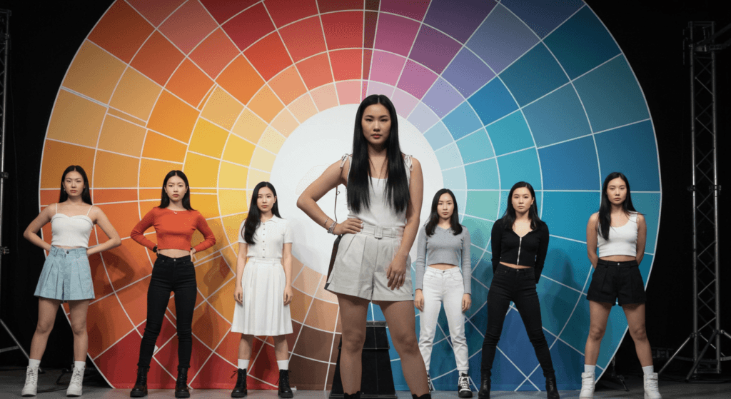
Color Coordination in Fashion
Color coordination plays a vital role in fashion, enabling individuals to create visually appealing outfits that express their personal style. To master the art of color mixing, it is essential to understand the basic principles that govern color palettes. One effective approach is utilizing a seasonal color palette, which involves selecting colors that resonate with the current season. For example, spring may favor pastels and vibrant hues, while autumn typically embraces earthy tones and deep shades. These seasonal variations help individuals align their wardrobe choices with the ambiance and mood of the time of year.
When considering outfit combinations, one crucial tip is to adopt the 60-30-10 rule. This rule suggests dividing color proportions within an outfit for optimal harmony: 60% of a primary color, 30% of a secondary color, and 10% of an accent color. Incorporating this balance can elevate an outfit’s overall aesthetic. Moreover, opting for a monochromatic scheme—variations of a single color—can create a sleek and sophisticated look. For example, different shades of blue paired together can provide an elegant yet cohesive appearance.
Accessorizing is another valuable aspect of effective color coordination. The right accessory can significantly enhance an outfit by introducing an unexpected pop of color or complementing the existing palette. For instance, a neutral outfit can be invigorated with vibrant accessories such as scarves or bags that introduce contrasting colors. Additionally, ensuring that makeup colors align with the outfit can create a seamless and polished look. When mastering color coordination tips, it is equally important to consider the materials and textures of clothing and accessories, as they can alter how colors are perceived.
By applying these practical color coordination strategies in fashion, individuals can confidently experiment with mixing colors while ensuring a cohesive and stylish ensemble that reflects their unique tastes.
Color Coordination in Interior Design
Color coordination plays a significant role in interior design, affecting not only the aesthetic appeal but also the ambience of a space. Selecting wall colors, furniture, and decorative elements requires an understanding of how different hues interact and complement each other. Effective color coordination tips can transform an ordinary room into a harmonious retreat.
When choosing wall colors, it is crucial to consider the overall theme of the room. Neutral palettes often serve as a versatile foundation, allowing for bolder furniture and decor choices. However, if a room is intended to feel vibrant and energizing, opting for warmer tones may enhance that atmosphere. To ensure a balanced look, one should always think about how to mix these hues with textiles and furnishings. Complementary colors, which are opposite each other on the color wheel, can add a sense of dynamism while maintaining visual harmony.
While selecting furniture, it is essential to choose pieces that resonate with the established color scheme of the walls. For instance, a rustic brown sofa could beautifully contrast a soft pastel wall, offering depth to the overall design. Additionally, integrating various shades of similar colors can create an inviting layered effect, further exemplifying effective color coordination. Furthermore, the use of accessories such as cushions, rugs, and artwork can amplify this color palette, so they should also align with the room’s primary colors.
Ultimately, achieving a cohesive look throughout a space involves a careful selection of all components, from furniture to decorative accents. By focusing on how to mix different tones and evaluate their interactions, one can create an engaging environment that is both functional and aesthetically pleasing. Striking the right balance with these color coordination tips will undoubtedly help in designing a space that feels unified and well thought out.
Conclusion: Embrace Your Creative Style
In the journey of mastering color coordination, it is essential to recognize the power of your individual creativity. Throughout this blog post, we have discussed various color coordination tips that not only enhance your understanding of color mixing but also empower you to express your unique aesthetic. Understanding color theory, exploring various color palettes, and knowing how to mix colors effectively allows for a richer creative experience.
As you engage in your projects, remember that experimentation is key. The freedom to combine colors in ways that resonate with you can lead to exciting discoveries and innovative designs. It is important to trust your intuition when selecting colors; personal style plays a significant role in what resonates. The contrasts and harmonies you choose can evoke emotions and set the tone for your work, making each color combination a reflection of your vision.
Moreover, don’t shy away from taking inspiration from other sources, be it nature, art, or fashion. Using the color coordination tips outlined here, you can start to see color not just as a visual element but as a language that communicates your intent. Mixing colors is not merely a task; it is an opportunity to create a story through the hues you choose to incorporate.
In conclusion, mastering color mixing is more than following rules; it is about embracing your creative style and advocating for uniqueness in your color choices. The world of color coordination is vast, and there are endless possibilities waiting for you to explore. So, step forward, experiment freely, and enjoy the vibrant journey of mixing colors like a pro.


Great…